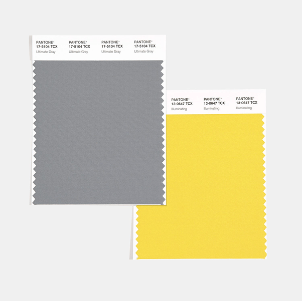
Illuminating & Ultimate Grey: The Pantones of 2021
The Pantone Color Institute has chosen two colours for 2021, read about them and how you might consider them for your brand packaging.


Image source: Pantone Color Institute
Pantone’s colours of the year provide excellent inspiration for a broad range of purposes, from branding and marketing to fashion and interior design. Pantone specialises in colour communication in many fields and their annual colour picks help to capture the mood of the year ahead.
Pantone’s colours of the year for 2021 are Pantone 17-5104 Ultimate Gray and Pantone 13-0647 Illuminating. Pantone says that these are “two independent colours that highlight how different elements come together to support one another”. Ultimate Gray is a soft, medium-darkness grey colour, while Illuminating is a bright sunshine yellow. The combination of the two colours is intended to convey practicality and building foundations while emanating warmth, strength, and positivity.
After the last year, people are looking for things that help to inspire them, give them energy, and create a positive outlook for the future. Both of the colours chosen for 2021 are warm and dependable, which is just what people are looking for after a year of uncertainty. These colours provide both a solid foundation in the grey and a sense of brightness and emboldened spirits with the yellow. Both shades evoke thoughts of nature too, from the grey of beach pebbles and weathered but enduring cliff faces to the bright yellow of the sun’s rays, flowers, and more.
Pantone has chosen two independent colours this year, but with the intention that they both come together “to express a message of strength and hopefulness that is both enduring and uplifting, conveying the idea that it’s not about one color or one person, it’s about more than one”.

Using these colour combinations for product packaging this year will help brands to appear reassuring and positive to their customers. When you choose these colours for packaging such as home fragrance packaging, you can create a feeling of dependability and a brighter future that will have consumers feeling better about where things are headed both in their personal lives and in the wider world.
These colours tap into some of the sentiments and feelings that people are sharing around the world. It iss important for everyone to come together and work as one in order to achieve progress. This is a consequence not only of the pandemic but other global events that have encouraged people to be more engaged in the world around them and their fellow humans, from Black Lives Matter movement across the globe, to agricultural protests in India.

Designing product packaging is about more than using your brand colours or making your products look attractive. Using the right colours can make use of colour theory and psychology, presenting consumers with products that speak to them on a deeper level through their packaging and more.
As well as paying attention to why these colours have been chosen by Pantone for 2021, it’s worth considering the general effect that Pantone’s colours of the year have on marketing and product design across multiple industries. People pay attention to these colours and are influenced by what is popular. This year, there are sure to be plenty of brands using these shades to connect with customers and add the modern edge for a current product.